original art
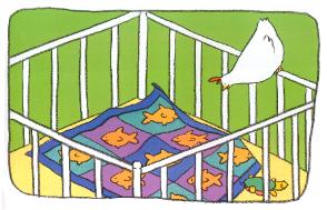
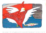
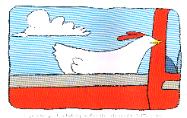
| Janet Stoeke's illustration work is done in a unique style. Each image is carefully designed and drawn onto heavy vellum paper. Vellum is translucent, and will not hold up to wet applications, but with it's tooth and texture, it is perfect for her signature crayon-like line. The next step is to trace the line onto watercolor paper, using a pencil and a light table. Janet uses gouache paints to carefully fill in the areas of color bound by the contour lines, occasionally using watercolor washes and splashing around a bit for a more relaxed feel. The printer receives the artwork with the black line registered above the color base art. He will shoot the color, then the black line, and combine them onto one printed proof. This proof is the first time Janet sees the composite art as it was intended. For display, Janet creates an acetate overlay of the black line and mounts it over the color base art, matting and framing the piece over both layers. Many pieces are available for purchase. Click here to inquire as to availability and pricing. |
Over the next two years, Janet Stoeke plans to
further develop her series of representational
paintings entitled “Solace,” that features images of
skies and other long views from which people derive
comfort.
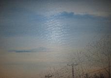
The impetus for this series began with the Newtown
tragedies. Almost every person who emerged from
the school looked up at the sky with expressions of
desperate need. Stoeke was painting abstract skies
at the time, exploring the freedom and lightness of
non-specific skies. She reveled in the natural
expansions of color and form without identity, and
the meditative, peaceful effect of those images. But
then a specific sky, the one over Sandy Hook
Elementary School, drew her attention, laden as it was
with the importance of having been witness to a great
sadness. The sky was asked again and again the
poignant questions regarding the losses and the
horror of the circumstances. The power of this
incident, and the emotional impact, inspired her to
paint THAT sky, and ground it in the particular trees,
telephone poles and horizon lines of the school.
Using compressed charcoal, she drew the non-sky
elements into the wet oil, rather than painting them,
scratching in limbs that reached upward for answers.
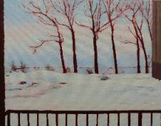
There is a second phase developing within the
series. In “Independent Living,” Stoeke has painted
the view that her mother-in-law Ebba gazed at for the
four years of intense grief following the simultaneous
loss of her home and her husband. These paintings
hint at a hope that Ebba’s face has shown her
recently. At 95, she has found a new serenity and joy
that had been previously inaccessible. Stoeke’s
intention was to honor, with the painted image, the
positive effect that this view of Lake Superior had on
Ebba. She would look out at it daily, reaching for a
better frame of mind. It was gratifying to see the
“lake effect,” take hold.
Paintings that define this non-religious but
transcendent search for answers continue to find their
way into her experience. Stoeke has painted the sky
over the driving range where her father died suddenly
of a heart attack. On her easel is a painting of the
sky a friend sought out while nursing her brother
through his last days. The vista over the ocean
helped her shift her spiraling mood to one of peace
and acceptance. The potential of this series is vast,
and for Stoeke, ripe with emotional depth. It fuels
her nagging need to paint and allows her the fullest
expression of feeling she has known.
further develop her series of representational
paintings entitled “Solace,” that features images of
skies and other long views from which people derive
comfort.
The impetus for this series began with the Newtown
tragedies. Almost every person who emerged from
the school looked up at the sky with expressions of
desperate need. Stoeke was painting abstract skies
at the time, exploring the freedom and lightness of
non-specific skies. She reveled in the natural
expansions of color and form without identity, and
the meditative, peaceful effect of those images. But
then a specific sky, the one over Sandy Hook
Elementary School, drew her attention, laden as it was
with the importance of having been witness to a great
sadness. The sky was asked again and again the
poignant questions regarding the losses and the
horror of the circumstances. The power of this
incident, and the emotional impact, inspired her to
paint THAT sky, and ground it in the particular trees,
telephone poles and horizon lines of the school.
Using compressed charcoal, she drew the non-sky
elements into the wet oil, rather than painting them,
scratching in limbs that reached upward for answers.
There is a second phase developing within the
series. In “Independent Living,” Stoeke has painted
the view that her mother-in-law Ebba gazed at for the
four years of intense grief following the simultaneous
loss of her home and her husband. These paintings
hint at a hope that Ebba’s face has shown her
recently. At 95, she has found a new serenity and joy
that had been previously inaccessible. Stoeke’s
intention was to honor, with the painted image, the
positive effect that this view of Lake Superior had on
Ebba. She would look out at it daily, reaching for a
better frame of mind. It was gratifying to see the
“lake effect,” take hold.
Paintings that define this non-religious but
transcendent search for answers continue to find their
way into her experience. Stoeke has painted the sky
over the driving range where her father died suddenly
of a heart attack. On her easel is a painting of the
sky a friend sought out while nursing her brother
through his last days. The vista over the ocean
helped her shift her spiraling mood to one of peace
and acceptance. The potential of this series is vast,
and for Stoeke, ripe with emotional depth. It fuels
her nagging need to paint and allows her the fullest
expression of feeling she has known.